Maria Stegner
Product Designer | maria.stegner@gmail.com
About the Project
AFAR is a travel media startup whose mission is to “inspire, guide, and enable travelers to have deeper, richer, and more fulfilling experiences” and our vision “to be the leader in taking the world’s best travelers from inspiration to action.” One of my first projects involved refreshing the homepage and article page designs to better reflect the company’s branding, aesthetic, and mission. The existing homepage had been cobbled together over the years by several different designers and developers (and without adhering to any style guide), and this project gave us the opportunity to improve it in a way that would be beneficial to our readers and business interests.
The Challenge
Even though the homepage did not get a lot of traffic, we felt it was important to make it a good experience for new users and potential business partners. We decided to update the content, layout, and visual design so that it would be more consistent with the company’s evolving branding, while also showcasing more of the content offerings available on our platform.
Another challenge was the fact that the content on our old homepage was populated by various editors who would have to manually update each of the content modules. This process was time-consuming, and sometimes did not get done as frequently as needed to keep the content fresh and maintain our image as a trusted travel authority. As part of the new design, we would also build back-end algorithms to populate the content dynamically on an ongoing basis, without any one person needing to manually go into the CMS and make changes to the homepage.
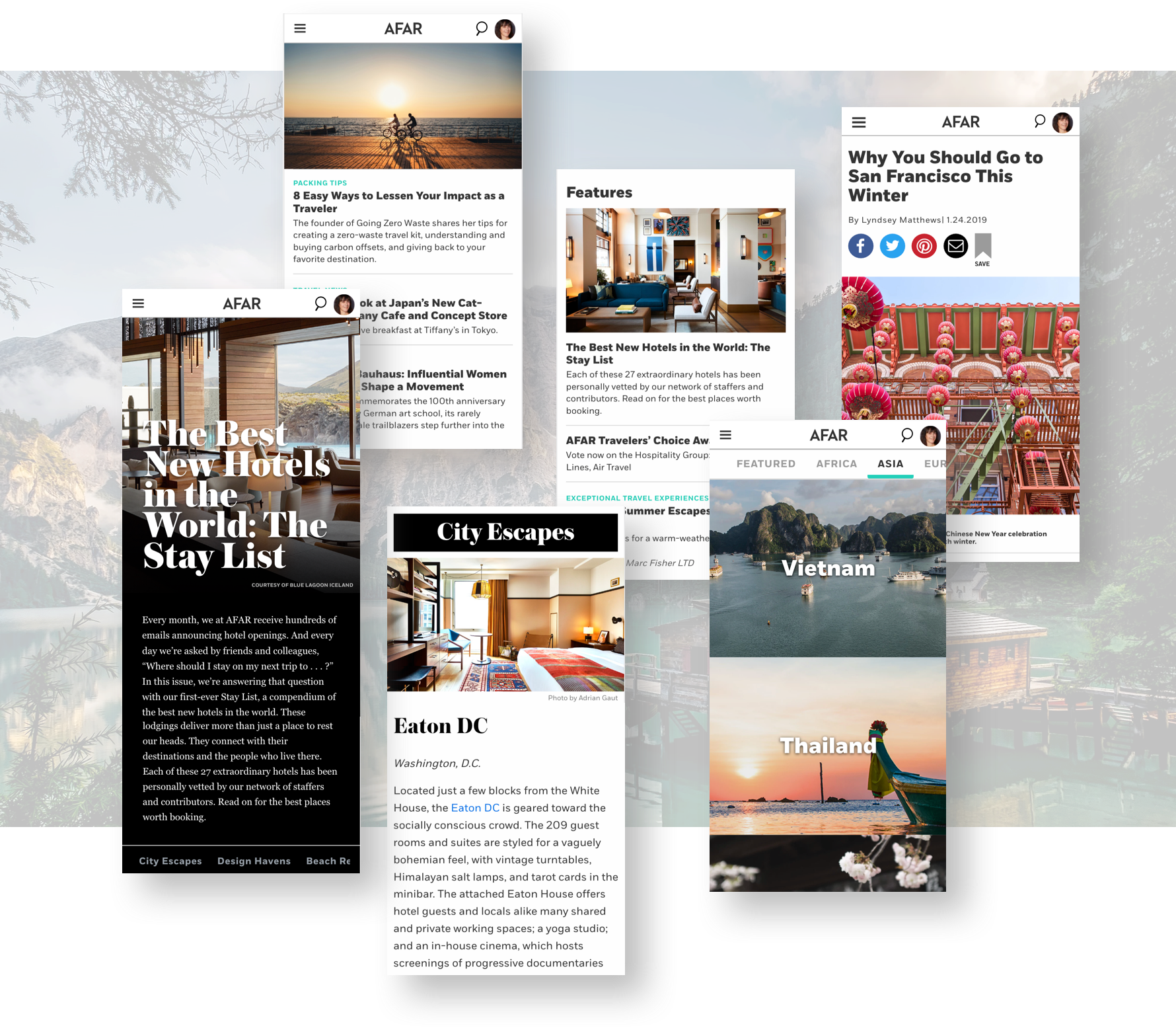
Below is a screenshot of the old homepage, where you can see some of the key areas we would improve:
THE OLD HOMEPAGE (WEB)

What We Did
As the project lead, I met with all the internal teams (editorial, sales, marketing, audience development, engineering) to understand the business goals of each team and how it related to the homepage, and together we came up with a wish-list of what we would like to accomplish with the new design.
Our goals for the new design were to:
Make the homepage more scannable, and more effective at reflecting the company’s mission to inspire the world’s best travelers to action
Update the visual design so it was more aligned with the company’s evolving branding, by using more photography and current typography styles
Organize the articles and travel guides in a more logical and intuitive way for a better content discovery and engagement
Increase production efficiencies by auto-populating as much of the content as possible, so that the editors would not have to do it manually
Include additional content like videos and travel guides, and showing a greater variety of content which would help create trust in our brand as an authority and travel resource
WIREFRAMES
I created a series of wireframes that would address our goals for the new design, relying on my expertise in editorial design for page layout, typography, and visual hierarchy. The team decided that we should highlight the travel guides and travel-related articles, so those modules ended up at the very top:


Hi-Fidelity Mockups
I added images and color, in order to give everyone a more accurate depiction of the new design. Below are the hi-fidelity mockups of the homepage design that we launched:

User Testing
Due to budget and time constraints, we tested the new designs internally amongst our team, which isn’t ideal but we did it anyway. There were no major problems with the proposed designs, so we decided to launch them and track performance on the live site.
Preliminary Results
Once we agreed on the final design, I created specs for the engineering team, and helped QA the page build for launch.
Two weeks after the new homepage was launched, we looked at the user data in our analytics dashboard. We saw some positive effects from the new design:
7% increase in engagement
time on page up by 8 seconds
6% decrease in bounce rate
5% decrease in exit rate
50% decrease in the amount of editor time needed to update the homepage content
Now that we have some data, we plan to make more small, iterative design changes to the page in an effort to get even better engagement and recirculation across the site.
Check out the live site: https://www.afar.com/
Project Team
UX Design - Maria Stegner
Engineers - Yue Weng Mak, Adan Alvarado
Digital Content Director - Arabella Bowen