Maria Stegner
Product Designer | maria.stegner@gmail.com
The Challenge
Focusmate was an early-stage startup developing a peer-to-peer accountability platform connecting people using virtual co-working sessions. Founder and CEO Taylor Jacobson hired me to:
Redesign the user interface so that more people can book co-working sessions
Improve the app's overall user experience
Develop the product’s branding and visual design
Taylor and I met with the engineering team in an effort to better understand the scope of the work, and identify potential areas for improvement. Since the product already had a small user base, we were able to gather valuable feedback on the existing product and the users' wishlist for future features.
My Role
Using the data we gathered, we created personas to help us think about the users with more empathy. In order to identify potential pain points along the user journey, I created user flows, site maps and wireframes for key actions within the app. I developed the app's visual design and branding through typography, color, and design, and created a pattern library for us to reference when building out future elements and features for the app on desktop and mobile.
Scroll below for a chronological progression of our process and UX artifacts.
Team Focusmate brainstorm
More sketches
Below are some early sketches of some of the key screens and interactions we would need to build into the focusmate app. The main task of the platform was the ability to book a co-working session with another person, so we needed a good calendar interface.
Lo-fidelity wireframes for some of the app's features.
Sketch of the calendar page
Wireframes
Below are wireframes for 3 versions of the calendar page. We decided to move forward with the third option, shown on the right, because it would allow each user much more flexibility in booking several co-working sessions over an infinite time period, while showing a big-picture view of sessions booked by other users. The two options on the right did not have those capabilities.
Hi-Fidelity Mockups
I designed a few different hi-fidelity mockups in order to see what felt right with respect to color and visual language. We settled on a simple, minimal and utilitarian look that would be easy to use and intuitive. This was the most important screen of the tool, and we included the following functionality:
See what unmatched sessions have been requested by other users
Match with other users for a co-working session
Request a new session
Cancel a session
Turn on integration with other calendars (e.g. Google, Outlook, etc.)
Personalize the calendar view to only show a certain part of the day (e.g. 9am to 5pm)
Message co-working partner
Begin co-working session
Access user profile
Change time zone
Customize the calendar view to display day or week
Calendar Page
Profile Page
Visual Design
I created a simple guide to the colors, typography, and button styles, to help the engineers spin up new features more efficiently, and to provide some visual consistency across the platform.
Homepage Explorations
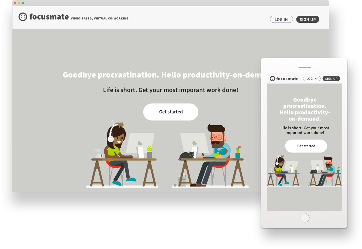
Here’s a look at some of the different design approaches we considered for the homepage and overall brand voice. We decided to go with illustration in the end, which lent our brand a bit of whimsy and humor. Check out the live site here.
Project Team
UX Design - Maria Stegner
Founder and Product Owner - Taylor Jacobson
Engineer - Mike Galanos