Maria Ermides Stegner
Product Designer | maria.stegner@gmail.com
protohack nyc
On November 5, 2016 I participated in the ProtoHack NYC hackathon at General Assembly, where several designers, developers and entrepreneurs came together to help solve a problem through design and technology. Our challenge was to use our creativity to prototype a solution to some facet of homelessness, and helping out the non-profit WeShelter, an app that lets people make a meaningful contribution to ending homelessness whenever they see someone in need.

the challenge
In New York City the homeless population has skyrocketed in recent years to levels not seen since the Great Depression and the story is the same in other major cities. Many feel the urge to help but don’t know how best to do it. Giving someone spare change won’t help the person get off the street, and calling 311 (as NYC recommends) isn’t always practical. The WeShelter apps are in the App Store and on Google Play, but many key improvements still need to be made.

We came together, formed teams and started brainstorming solutions to end homelessness. Some suggested directions included raising money, raising awareness, coordinating volunteers for food drives.

We had a chance to hear from Ilya Lyashevsky, one of the founders of WeShelter, about their mission and challenges. Ilya said they could use help with the app's navigation, UI, confirmation, validation, and overall user experience.
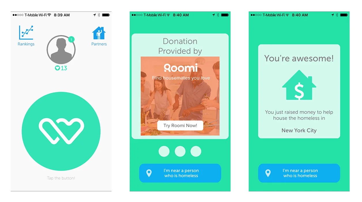
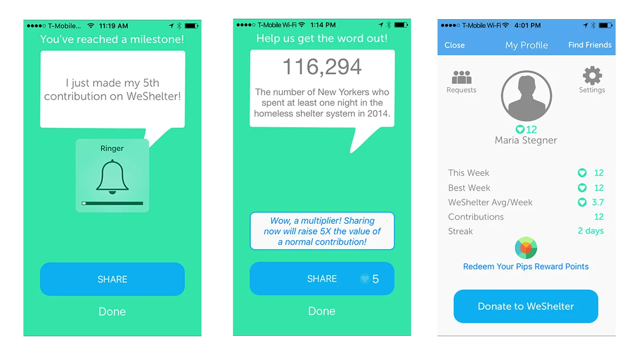
EXISTING APP SCREENS
Areas for improvement We spent some time interacting with the WeShelter mobile app, and came up with a list of items that could be improved:
1. Call to action - "tap the button" text is really hard to see, and the big logo doesn't read like a button. The overall purpose and structure of this page is confusing, and there is no explanatory text detailing what to do, and why.
2. After user taps the big green button, the app screen links to a navigation page where a giant ad takes over most of the screen. User is then prompted again to tap "I'm near a person who is homeless." This is confusing, because the user is already getting a confirmation that a donation was made, and that they helped raise money to help house the homeless in New York.
3. The app then moves through a couple more screens with speech bubble messages with some stats about the number of homeless people in the New York area in the year 2014, and another call to action to share this activity somehow.
4. Overall, the user interface could use some visual polish, and the user flow some better navigation. Additionally, some key language is needed in certain places to explain to the user what they are doing, and what effect their action will have.
There was much to do, and only a few hours until pitch time, so my team and I got down to business.
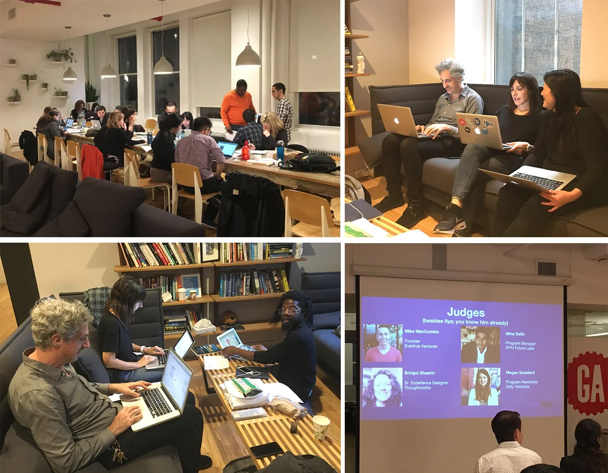
Some snapshots from the ProtoHack hackathon
WIREFRAMING NEW SCREENS
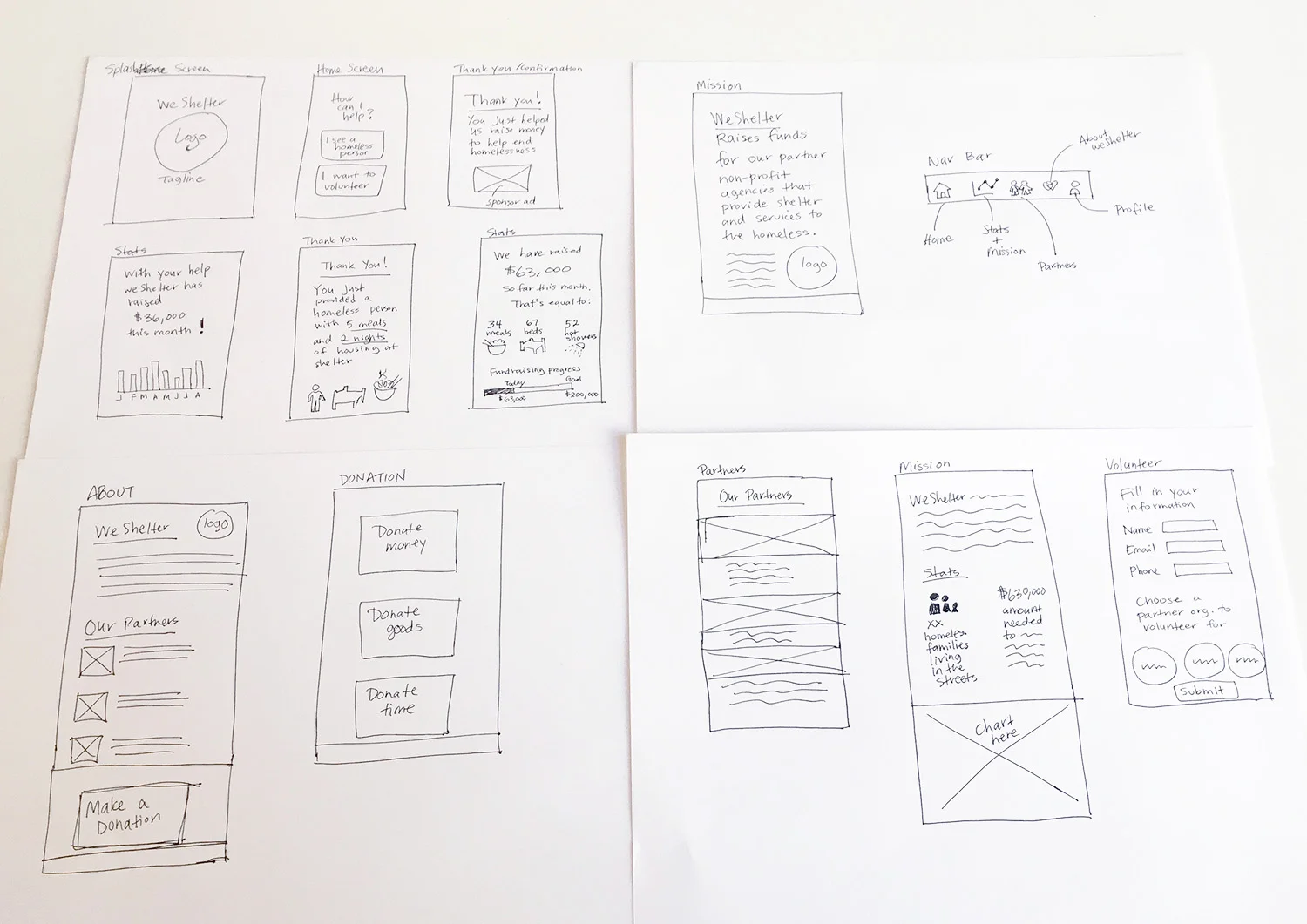
We thought that the app could use better navigation, more numbers and stats, better button design, infographics, and more information about WeShelter and their mission. Here is a list of new or improved features we would recommend for the app:
1. A splash page with logo and tagline that clearly states the non-profit's mission statement.
2. A clearly defined home screen giving the user choices in using different user flows: getting involved or volunteering, versus making a report about a homeless person.
3. Clear "thank you" page with language that validates/confirms the user's action, and a smaller, less intrusive sponsor ad.
4. A secondary "thank you" page that describes the impact of user's action in tangible quantities (eg, "you just helped us provide 2 meals to a homeless person", etc.).
5. An "About" page that briefly describes WeShelter's mission, their partners, and another call-to-action to make a donation.
6. A "Partners" page to showcase the non-profit organizations that benefit from WeShelter's fundraising efforts.
7. Some "Stats" pages with info-graphics representing some key figures, like the amount of funds raised, the number of homeless persons and families living in the streets, and how the fundraising helps make an impact.
8. A "Donation" detail page giving user options to donate their time, money, or physical goods.